Project Assignment
Blooming Impressions was the cumulative project of a packaging design course that focused on chocolate bar packaging. The assignment was to create a chocolate bar brand identity, bar form, and dieline considering aesthetic, sensory, and technical requirements.
Brand Identity and Packaging Design
ID 4863 Packaging Design
Summer 2025
ID 4863 Packaging Design
Summer 2025
Softwares
Adobe Illustrator, Adobe Dimension, Autodesk Fusion, Fantastic Fold, Procreate
Inspiration and Concept
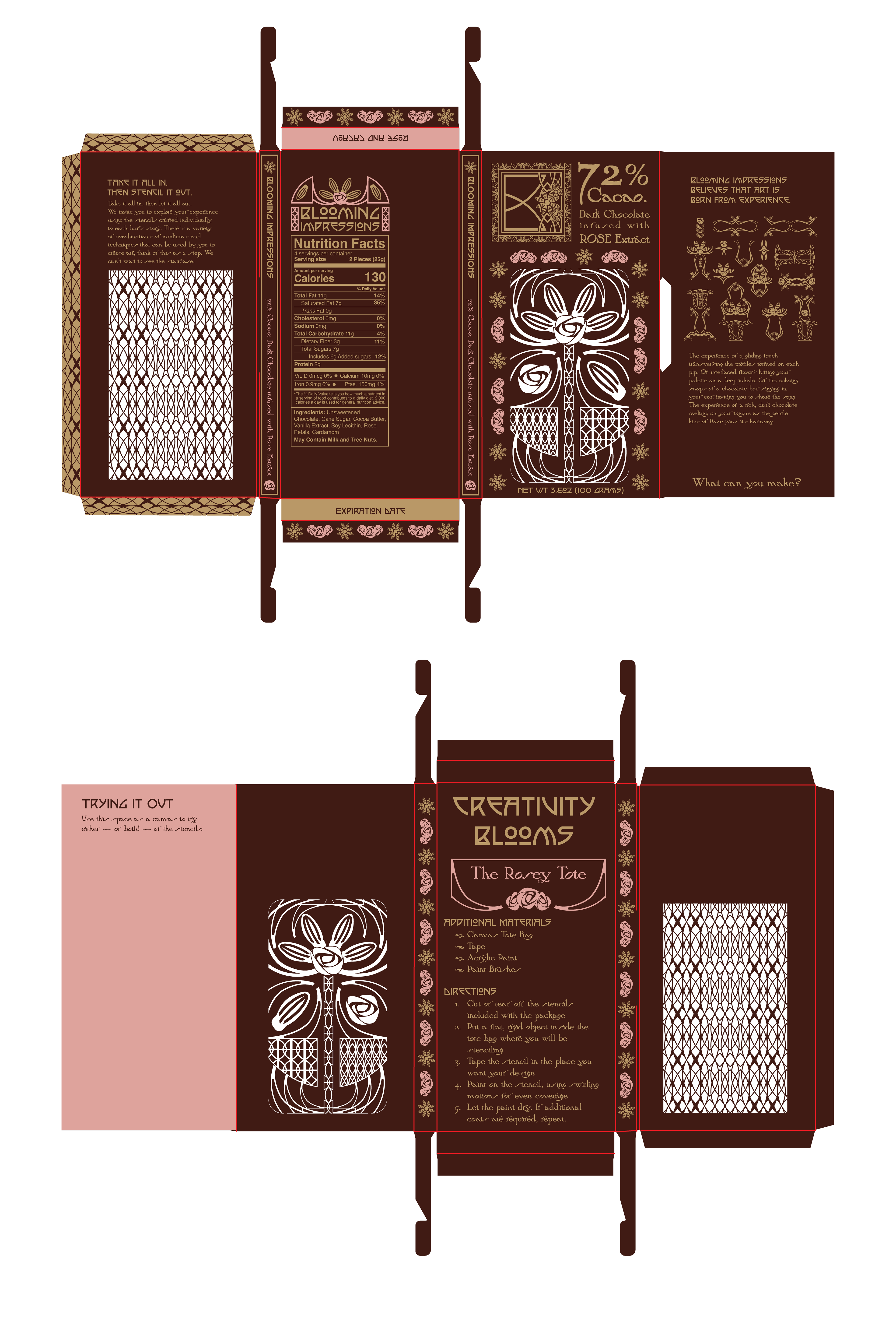
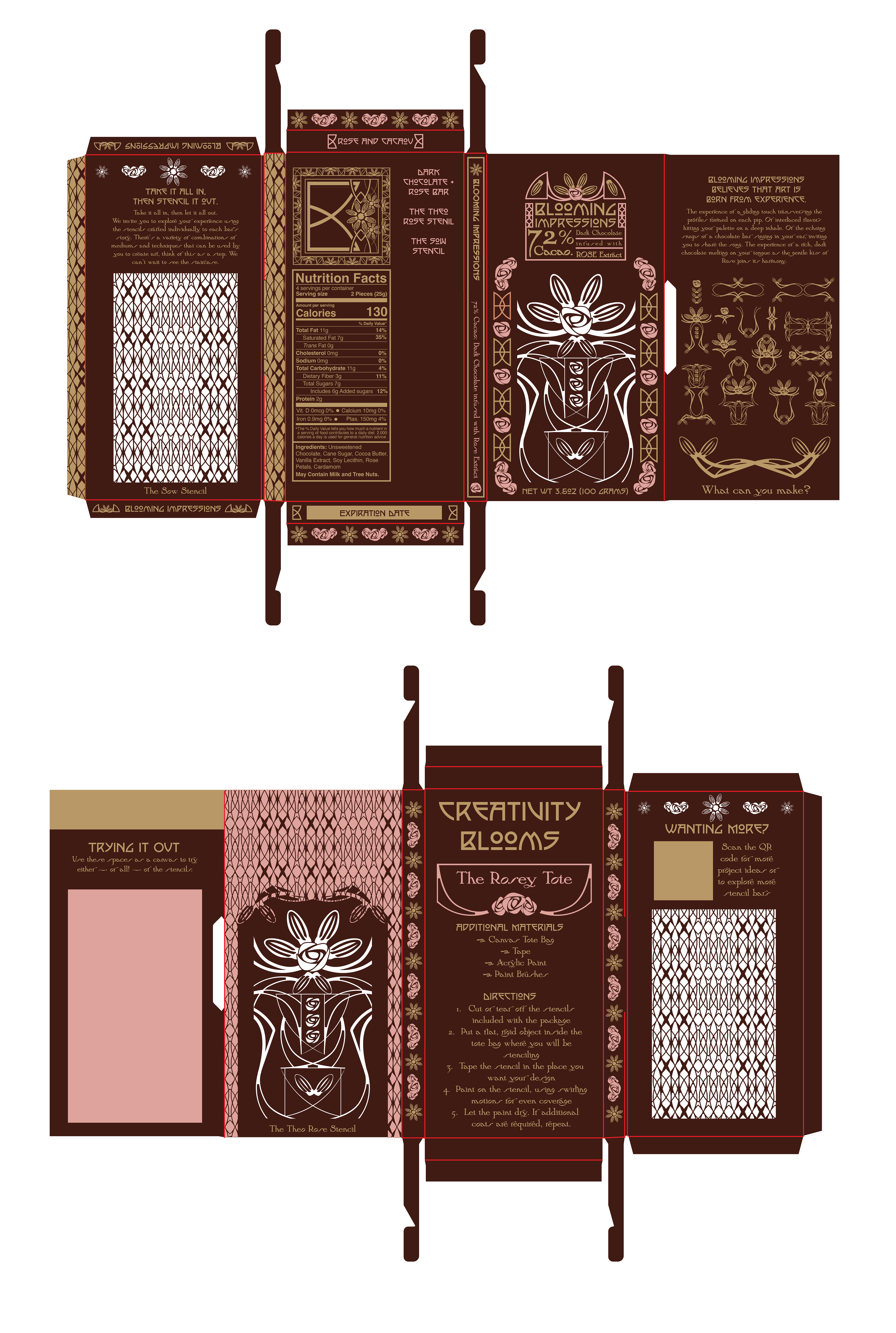
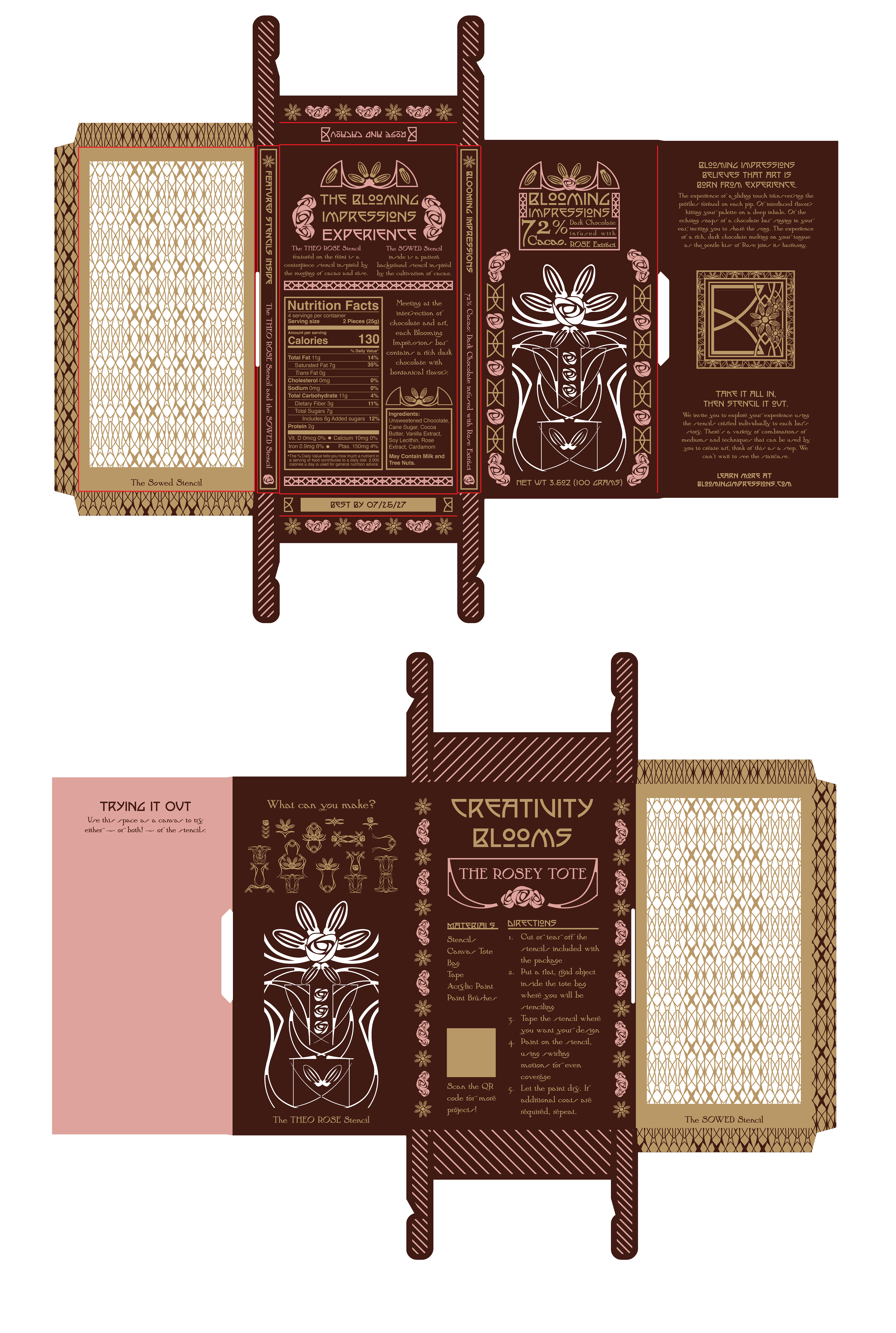
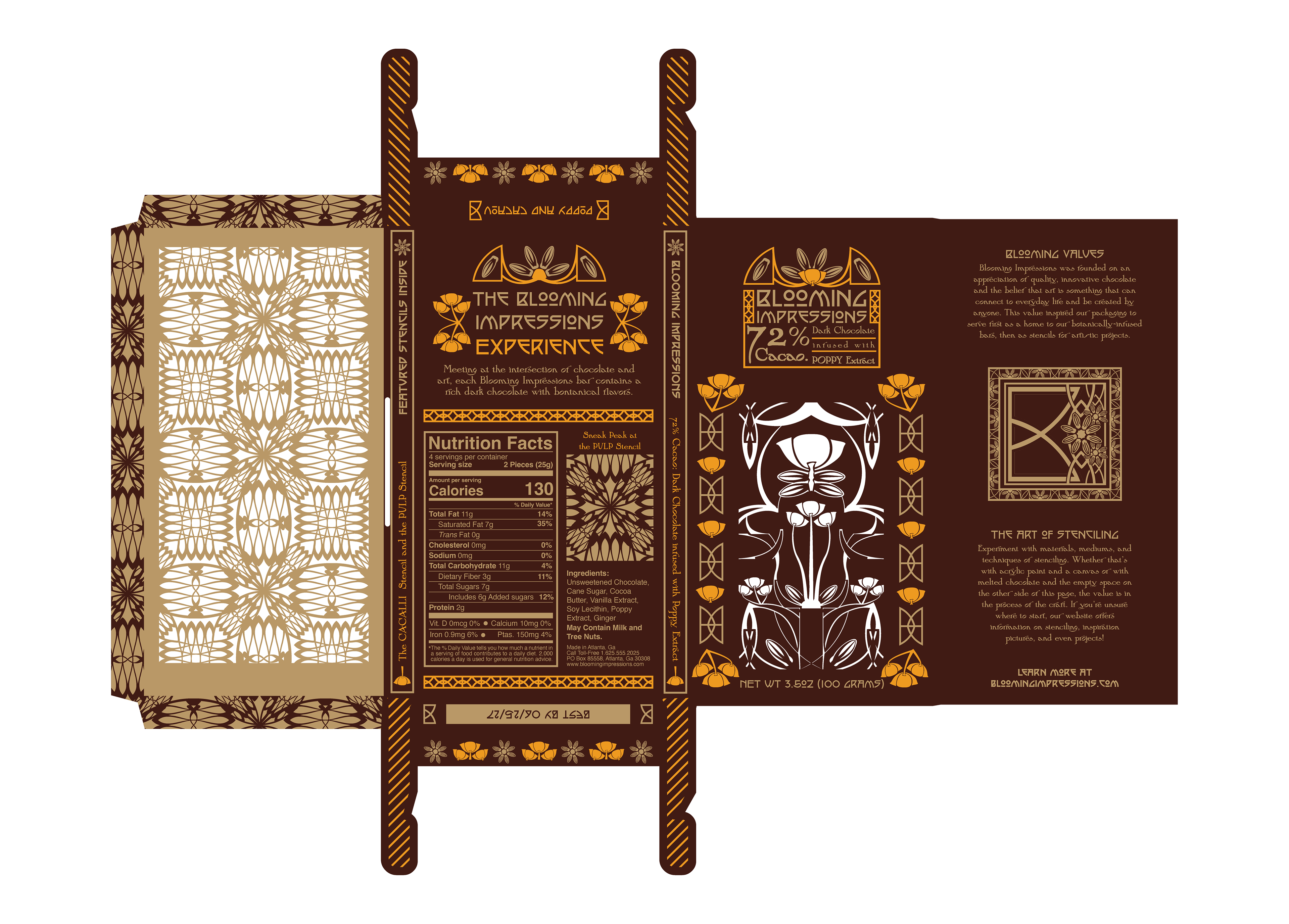
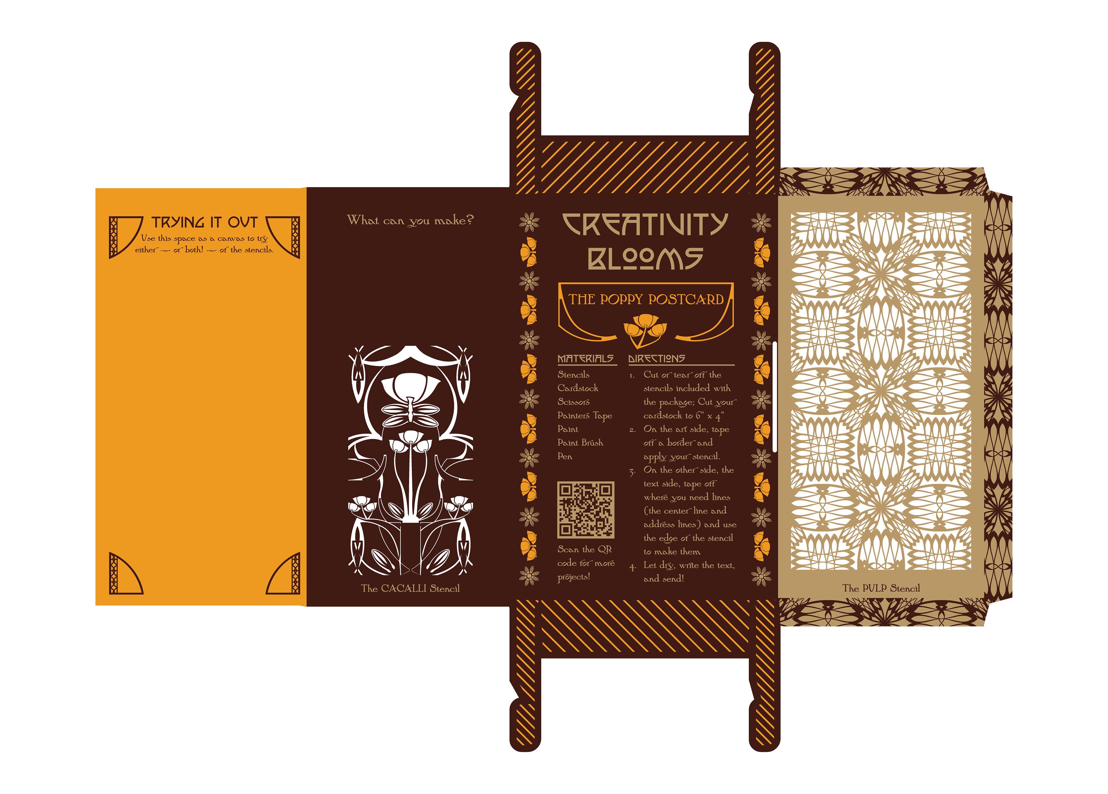
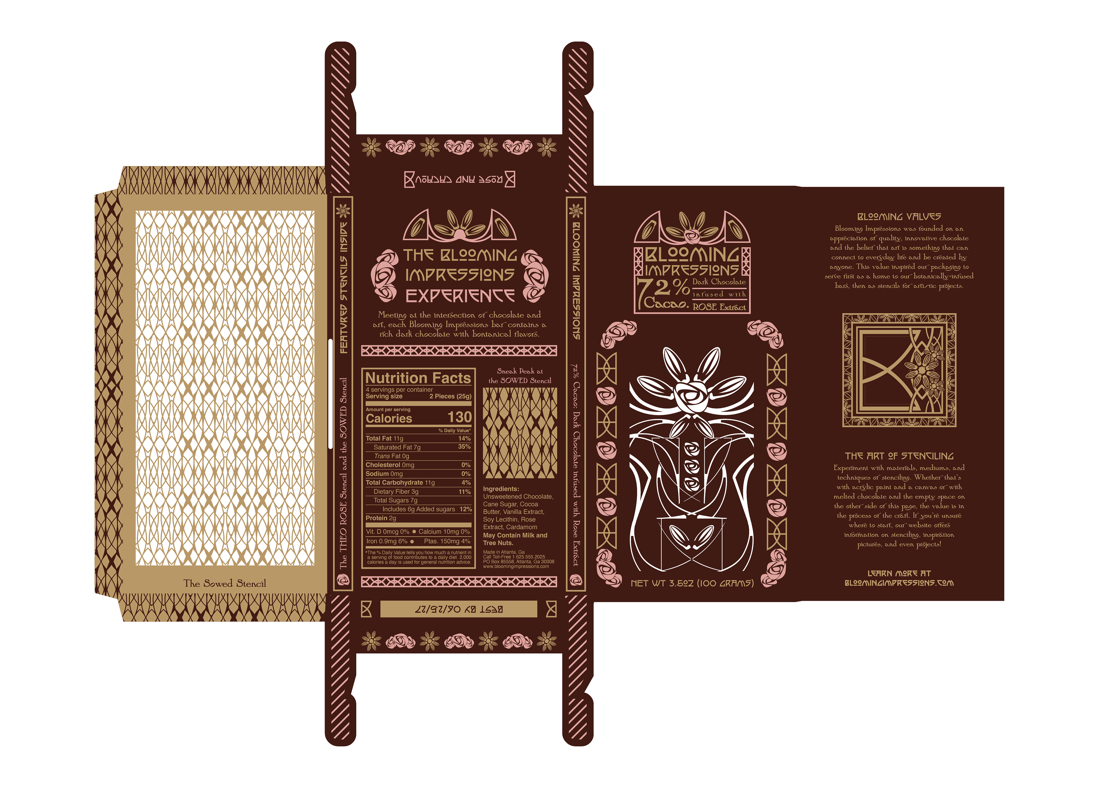
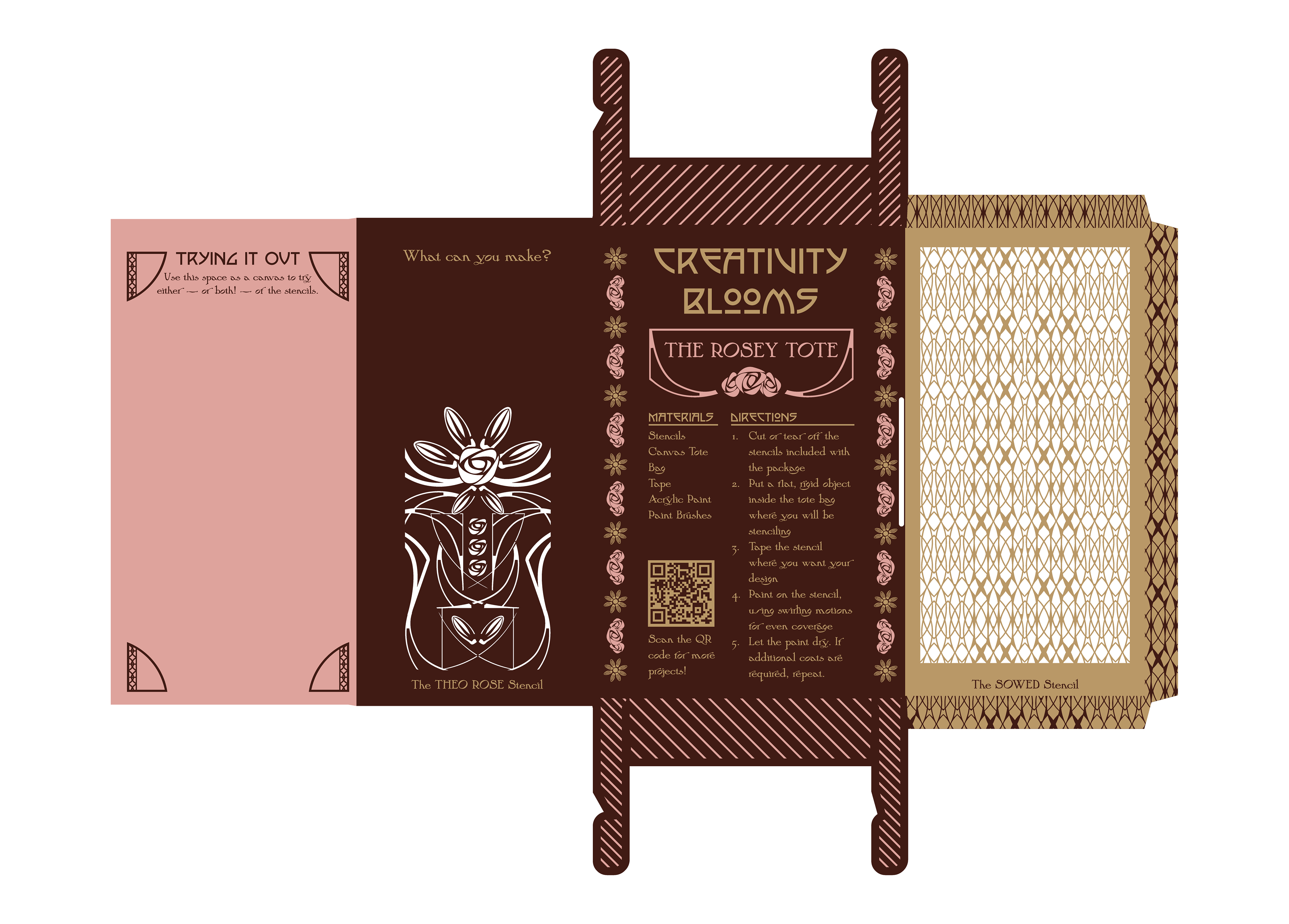
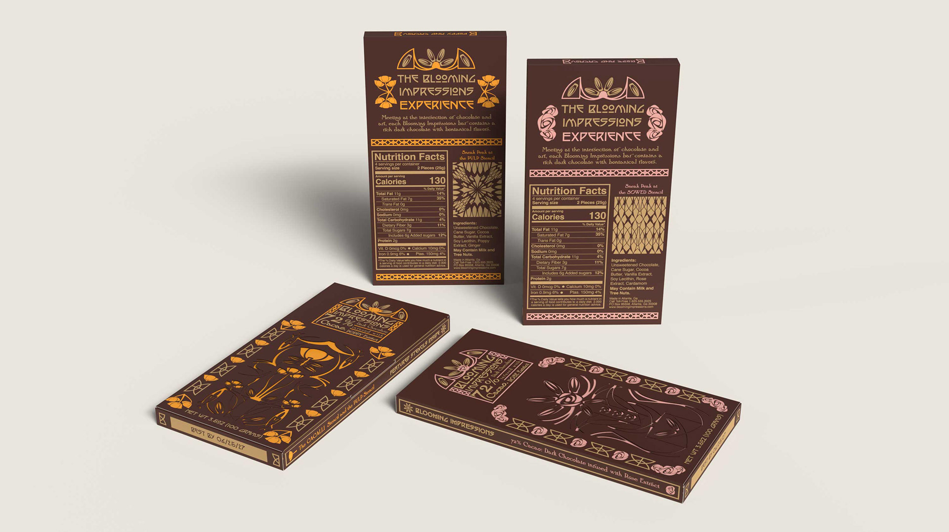
My concept bloomed from the values of the American Arts and Crafts movement—emphasizing multifunctionality and the belief that anyone can be a crafter. The Blooming Impressions bars are dark chocolate, featuring an additional flavor inspired by the motifs of the Arts and Crafts movement: rose or poppy, with potential to scale.
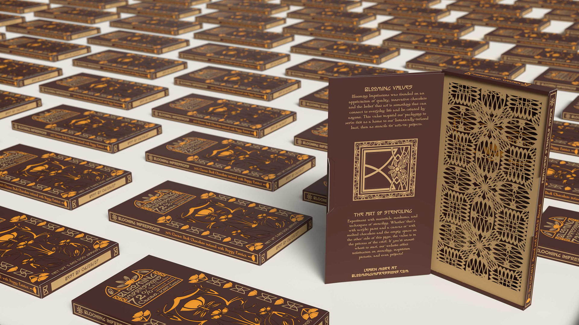
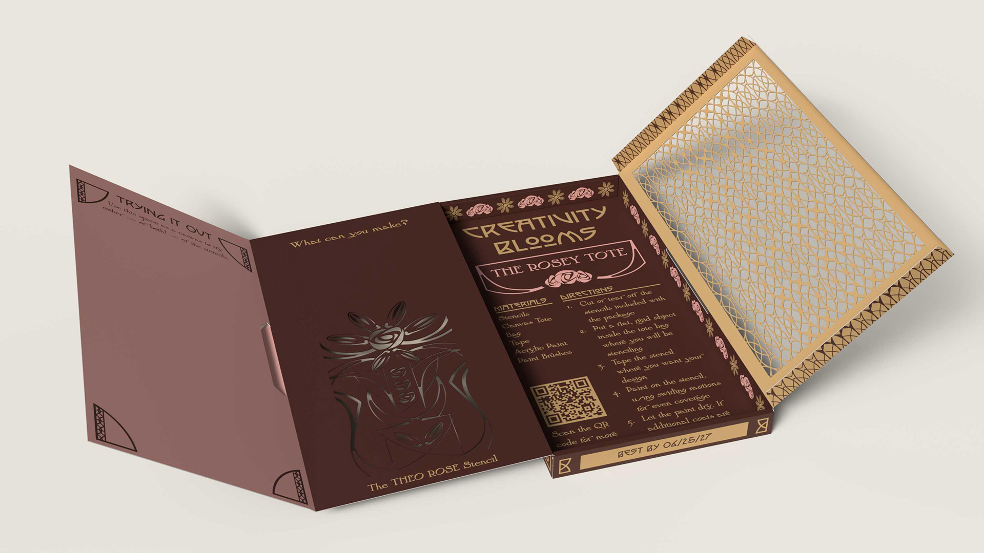
The packaging of Blooming Impressions offers two unique stencils that can be cut out and used in a variety of ways by chocolate lovers, as well as resources and guidance in the craft.
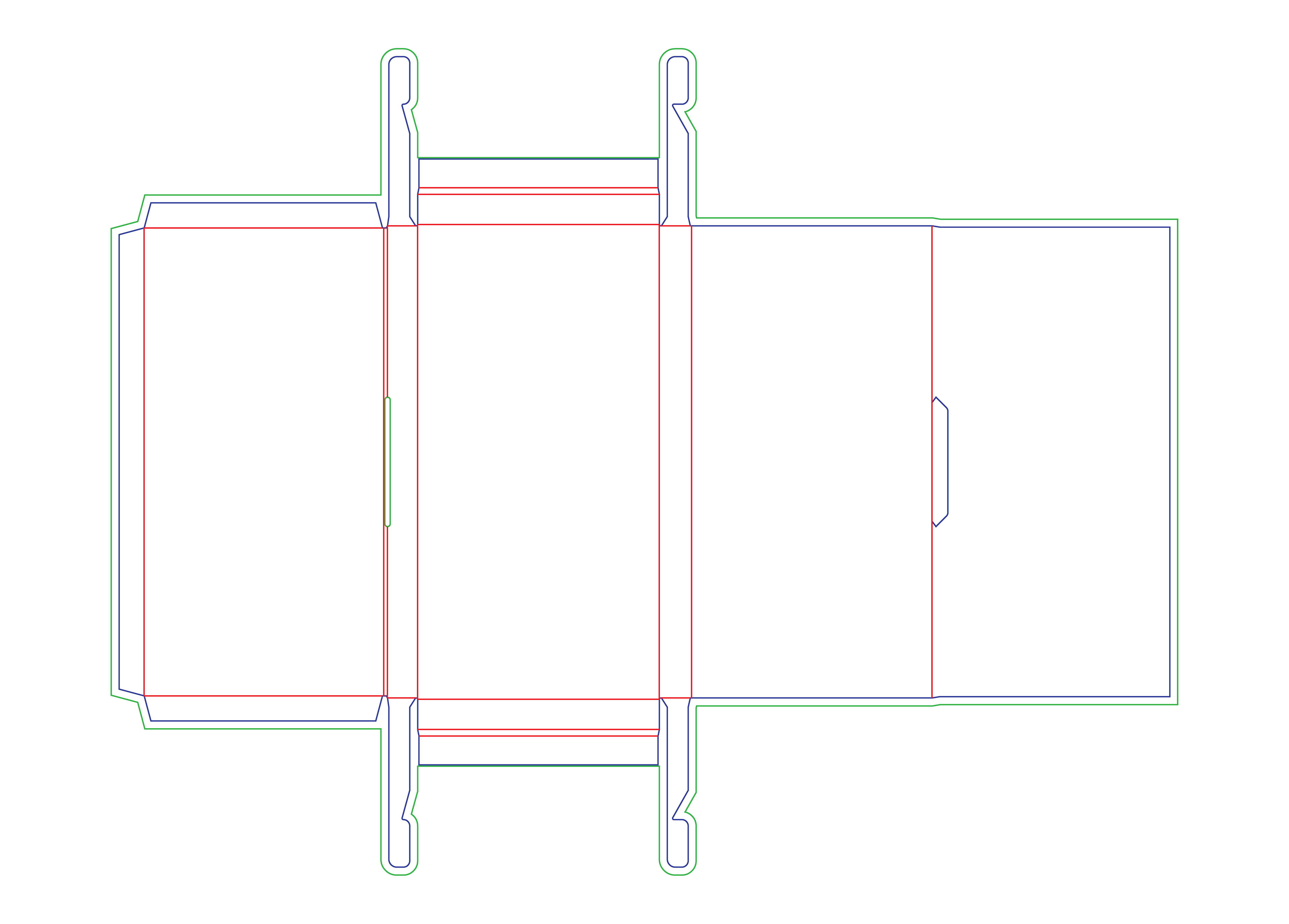
The Packaging Dieline and Real World Constraint
The dieline chosen for this concept had many design panels available that created a unique unpackaging experience for the user. The story and mission of Blooming Impressions is told in the ordering and hierarchy of information as the consumer reveals hidden panels and art.
FDA requirements for food packaging was met on all panels for the content and wording, typography, and accessibility. I used the Ghirardelli Intense Dark Chocolate Bar, 72% cacao, 3.5 oz bar as a reference for nutrition information.
The material is a .0197 in paperboard with laminated coating to make it both waterproof and durable as the stencils need to be reusable and long lasting.
The Process
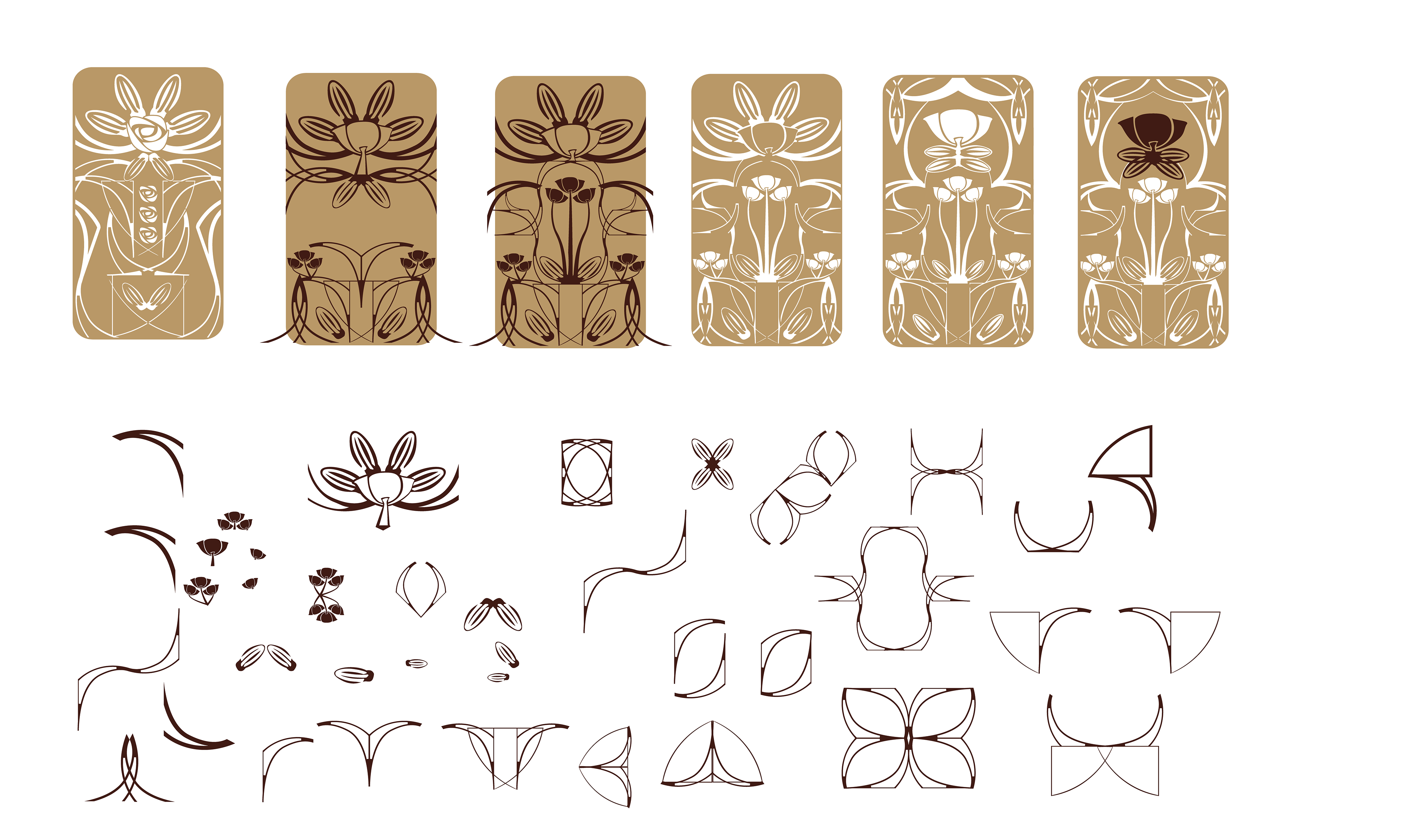
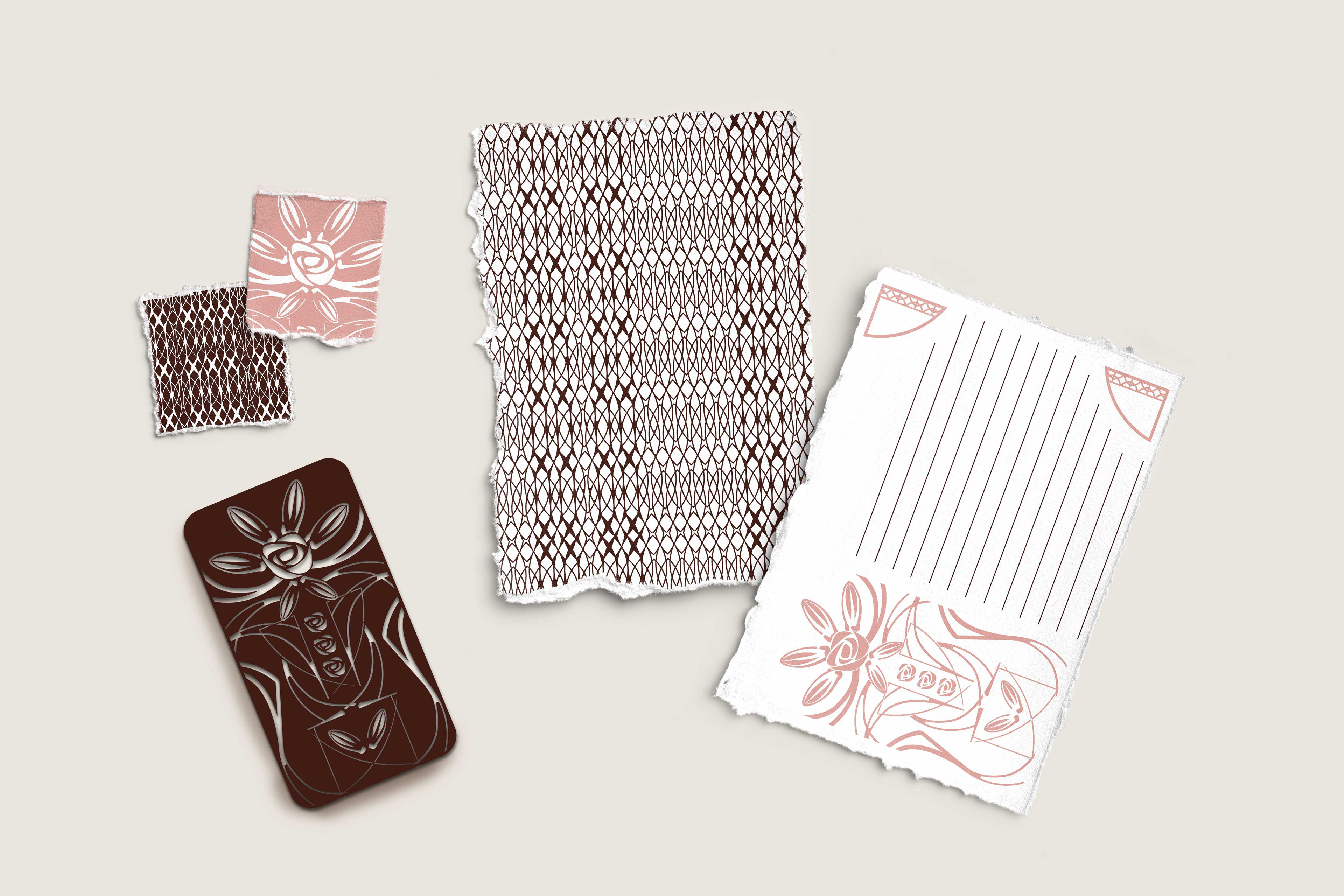
I designed the stencils with elements of the brand identity, either directly or creating new forms based on them. The main stencils tell a story of the ingredients, rose or poppy and cacao, coming together to form the chocolate bar. They represent themes of growth, separation, and bonding. Because I designed the rose one first, I kept it as a reference to ensure the visuals were cohesive.
I began the packaging with a dieline that folded out and with each draft, tested how the story was being told. The "scenes" of the story were pretty straightforward: the cover, the back, stencil areas, brand story, test area, and example project. But they needed to be ordered in a way that attracted a consumer, told the story of the brand and chocolate, and enticed them to use the stencil.