Project Assignment
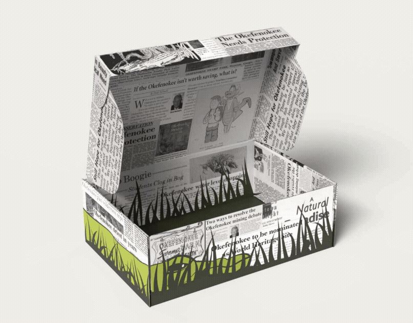
This shoe box packaging assignment required students to create a shoe brand identity, a packaging dieline, and renderings of the shoe box. The shoe itself was an assignment in an adjacent class where we created a pattern for felt shoes.
Brand Identity and Packaging Design
Introduction to Graphic Communications II
Spring 2025
Introduction to Graphic Communications II
Spring 2025
Softwares
Adobe Illustrator, Adobe InDesign
Concept Development
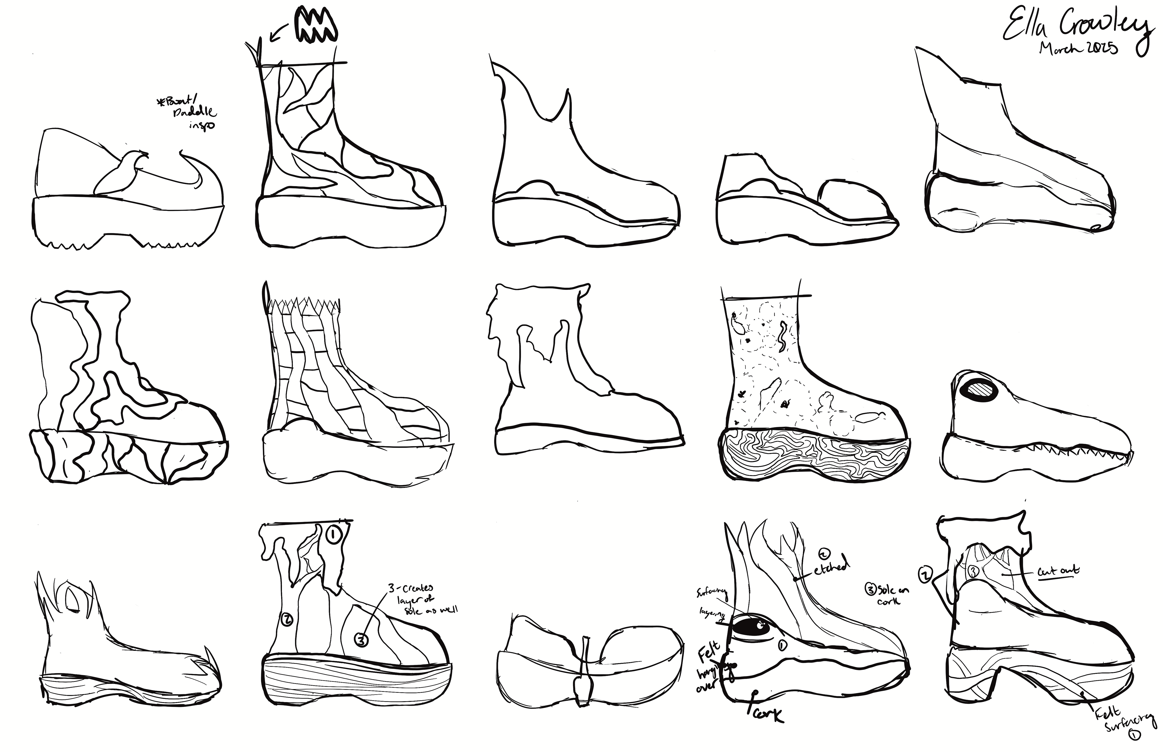
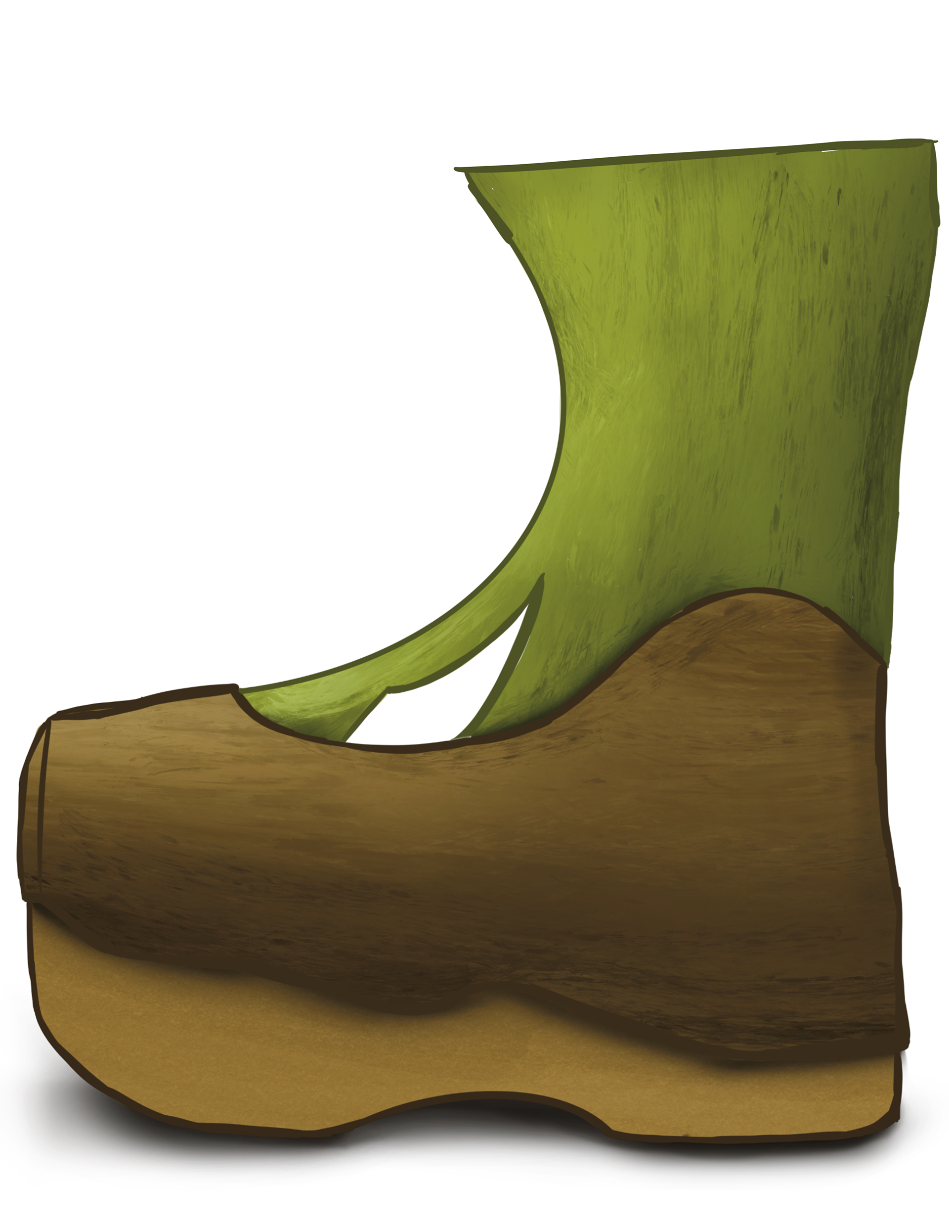
I conceptualized and iterated on the shoe design weeks before beginning the packaging. Building out my understanding of the shoe meant that creating a story for the brand came more naturally. This story and branding gave me a chance to make the shoes mean more.
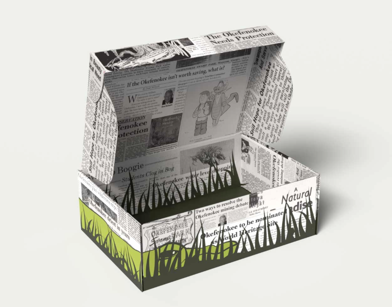
I was born in Waycross, Ga, so the Okefenokee Swamp holds a special place in my heart. While designing the shoe I was lead by different books and flyers and photos from my families "archives." When I started branding the shoes, I was able to create a mission and fledged out identity for it. Save the Swamp.
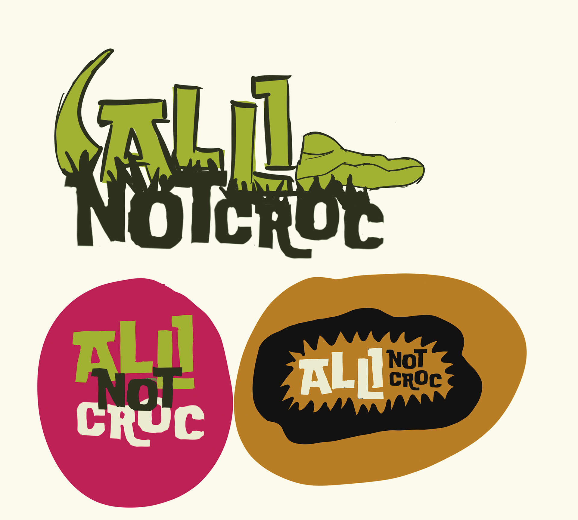
Alli Not Croc uses public domain archived media about the Okefenokee Swamp to advocate for the environment. While it's vector art and bright colors attract the younger target demographic, the logos built on news media acts to promote education and advocacy for the audience.
Did You Make Shoes?
Yes! If you'd like to see the process of making the Alli Not Croc boots, including market research, concept development, creating prototypes, and the final product, you can view the documentation here.


The Branding Process
After defining the brand story and finishing the shoe, I was able to start ideating on the brand visuals!
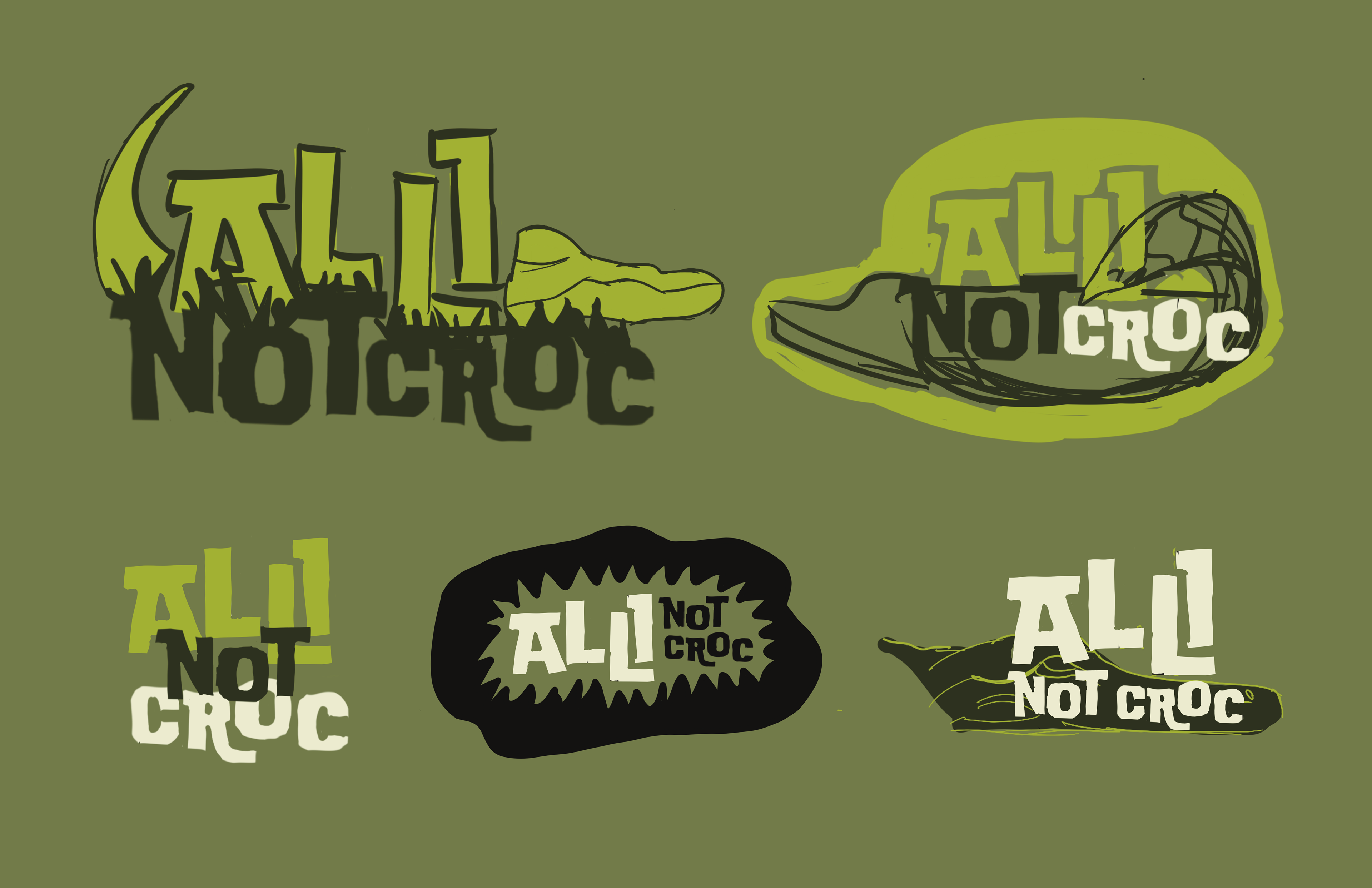
Type: I tested different types to find a display font that was bold, legible, fun, and had a loose block style to match the impact of the brand and mission with the ruggedness of the swamp then paired it with a clean sans-serif.
Primary Logo: To develop the main logo, I played with incorporating an alligator into the type. I ended up using sketches from the shoe ideation process to guide the shape of the alligator head, subtly nodding towards footwear in the form.
Texture and Backgrounds: I initially tested different nature inspired textures before coming up with the idea to use news sources as the primary pattern. This puts the mission of the brand at the center and offers logos through the use of real articles.
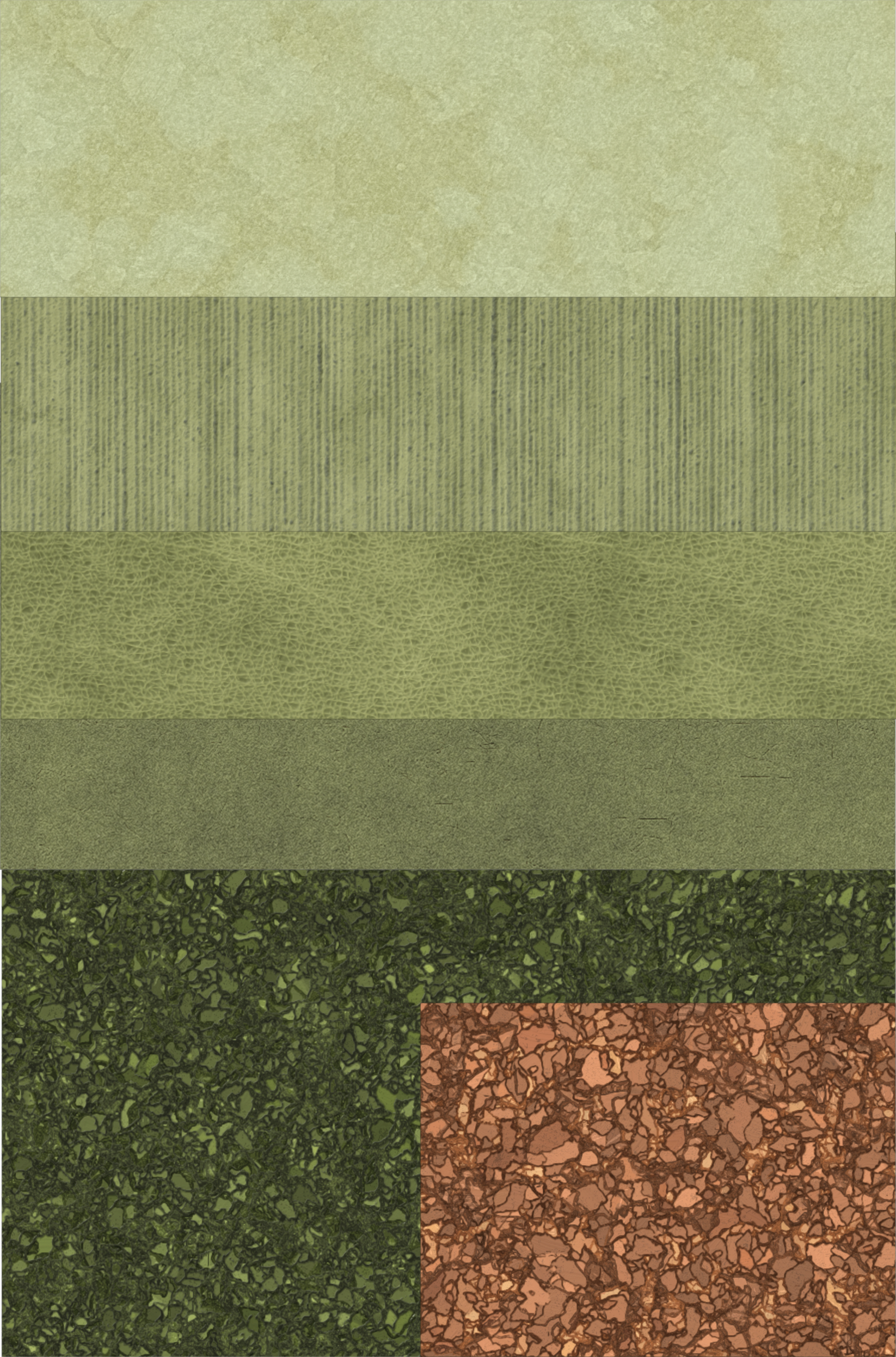
Color: When I began designing, the color palette was limited to the cream and greens at an attempt to line up with the idea of nature. But thinking back to the story of the brand, it is about the connection of the swamp and activism for younger demographics. The idea is not to represent nature but to represent the danger of overlooking nature. I looked primarily at hot pink and a bold orange and decided the having both detracted from the overall palette and that the orange paired best with the other colors and catered to a wider audience. Adding in the orange developed the edge and boldness that are core to the brand.