Project Assignment
Blooming Impressions was the cumulative project of a packaging design course that focused on chocolate bar packaging. The assignment was to create a chocolate bar brand identity, bar form, and dieline considering aesthetic, sensory, and technical requirements.
Brand Identity and Packaging DesignID 4863 Packaging Design
Summer 2025
Softwares
Adobe Illustrator, Adobe Dimension, Adobe Photoshop, Autodesk Fusion, Fantastic Fold, Procreate
Inspiration and Concept
While creating this project, I worked part-time at the Robert C. Williams Museum of Papermaking, part of the Georgia Institute of Technology, which was founded on the collection of Dard Hunter. His design work during the American Arts and Crafts movement while with Roycroft served as my initial inspiration for the project's visual language.
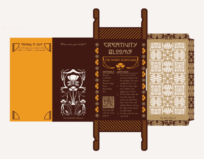
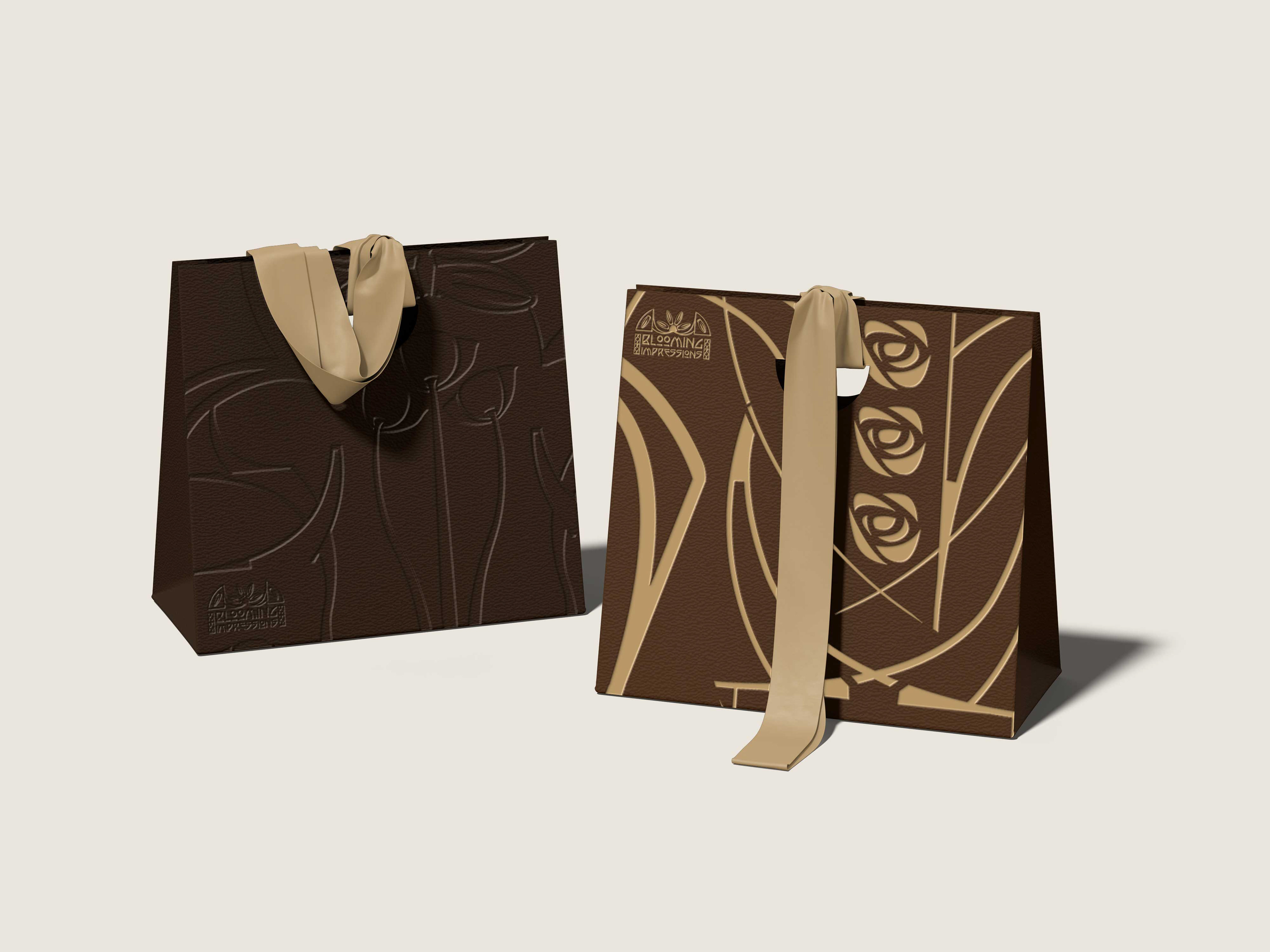
My concept bloomed from the values of the American Arts and Crafts movement—emphasizing multifunctionality and the belief that anyone can be a crafter. The Blooming Impressions bars are dark chocolate, featuring an additional flavor inspired by the motifs of the Arts and Crafts movement: rose or poppy, with potential to scale.
The packaging of Blooming Impressions offers two unique stencils that can be cut out and used in a variety of ways by chocolate lovers, as well as resources and guidance in the craft.


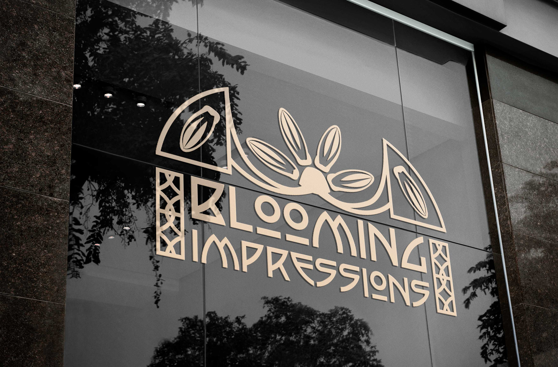
Store Application of Visual Identity
The Branding Process
Inspired by the Arts and Crafts movement, certain aspects of the branding—such as the color palette and typography—were straightforward decisions informed by research on the historical context of the movement and adjusted to align with modern luxury. When it came to deciding which elements needed to be included for the bar packaging, and which needed variations based on the flavor, my challenge was unifying all of the assets to have a cohesive visual language. My initial assets (pictured below) all evoke the Arts and Crafts movement but have distinctive styles that differentiate between them: the jagged lines of the cocoa pod is in stark contrast to the smooth curves of the rose below it.
The first way I unified them was by using parts of the base branding as small components in other elements. I used different letters of the brand typography as shapes to build parts of other elements such as the brandmark, the corner flourishes, parts of the stencils, and more.
The next unification came from using elements as a “guide” when I created new ones or updated old ones to ensure the style was the same. When developing the Poppy Bar assets, I kept the Rose Bar assets nearby to make sure they dimensionally and aesthetically made sense together and in place of each other.