Project Assignment
Blooming Impressions was the cumulative project of a class in Packaging Design that focused on chocolate bar packaging. The assignment was to create a chocolate bar brand identity, bar form, and dielines considering both aesthetic, sensory, and technical requirements.
Brand Identity and Packaging Design
ID 4863 Packaging Design
Summer 2025
ID 4863 Packaging Design
Summer 2025
Softwares
Adobe Illustrator, Adobe Dimension, Autodesk Fusion, Fantastic Fold, Procreate
Inspiration and Concept
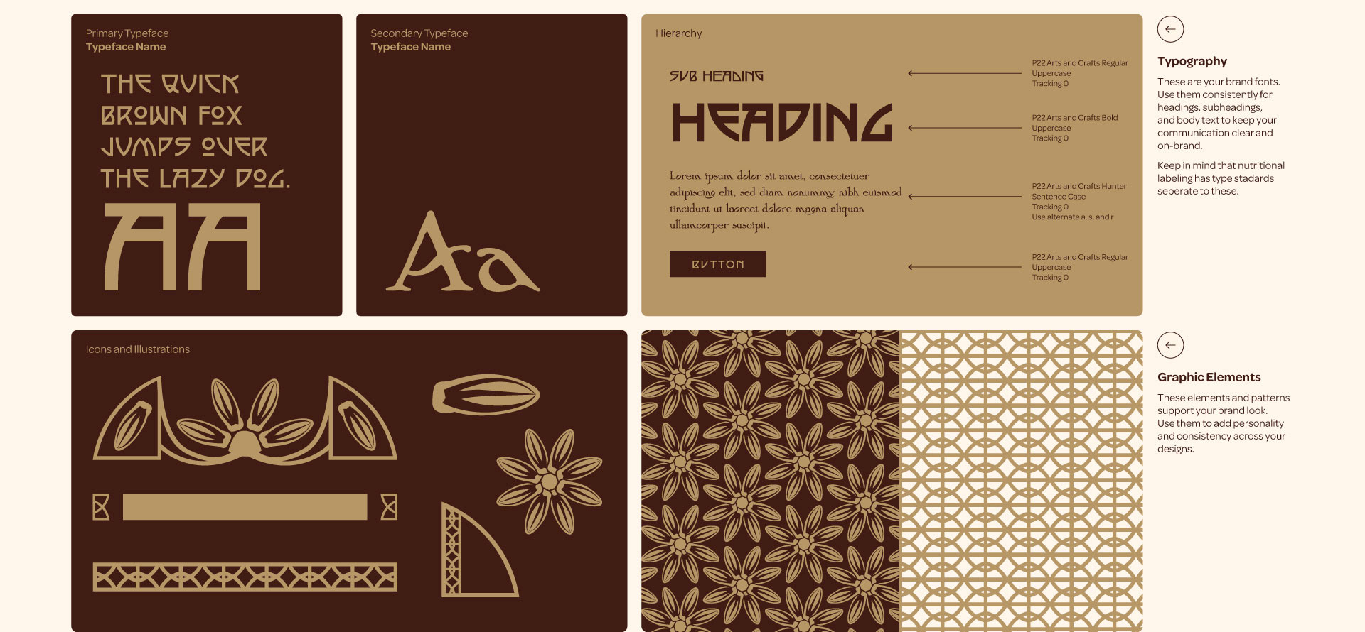
I worked part-time at the Robert C. Williams Museum of Papermaking, part of the Georgia Institute of Technology, which was founded on the collection of Dard Hunter. His design work during the American Arts and Crafts movement while with Roycroft served as my initial inspiration for the project's visual language.
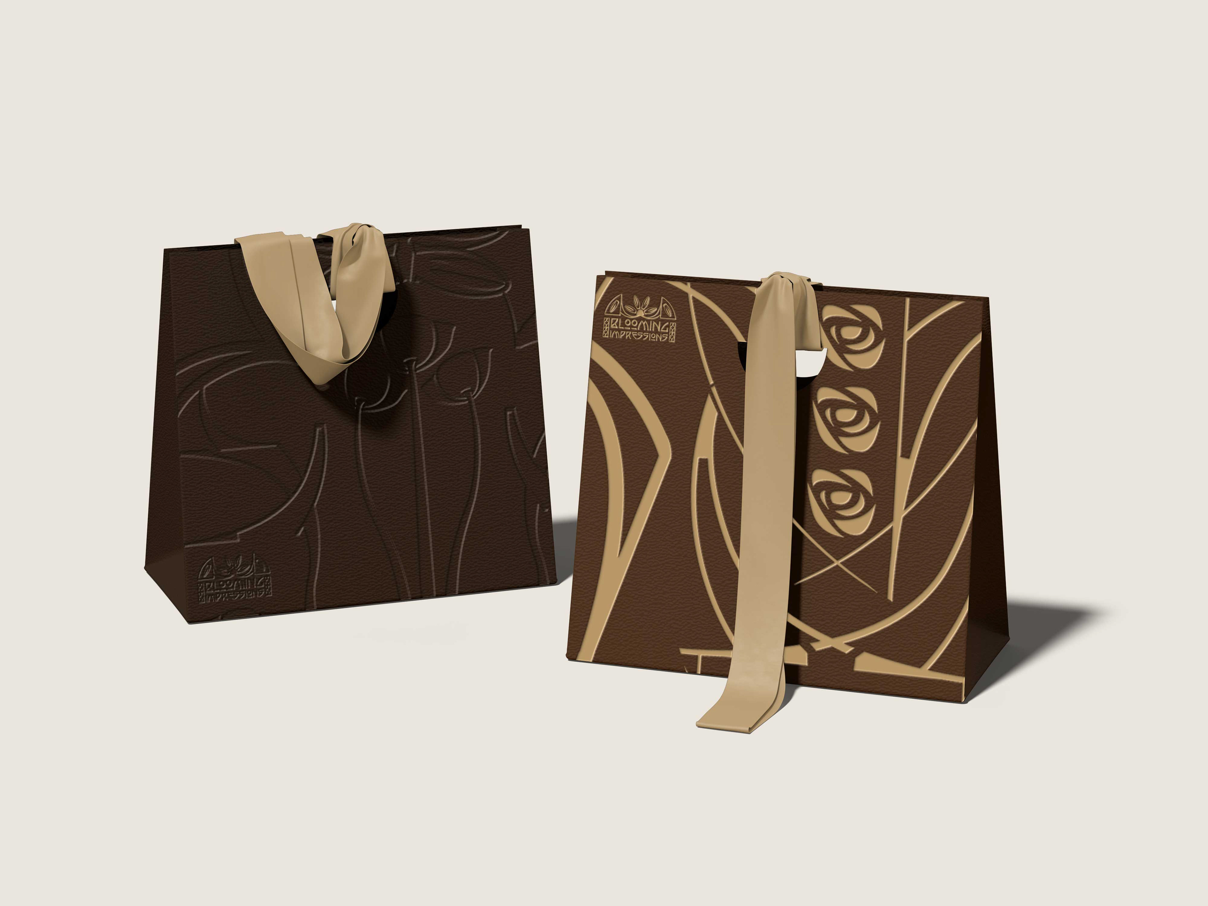
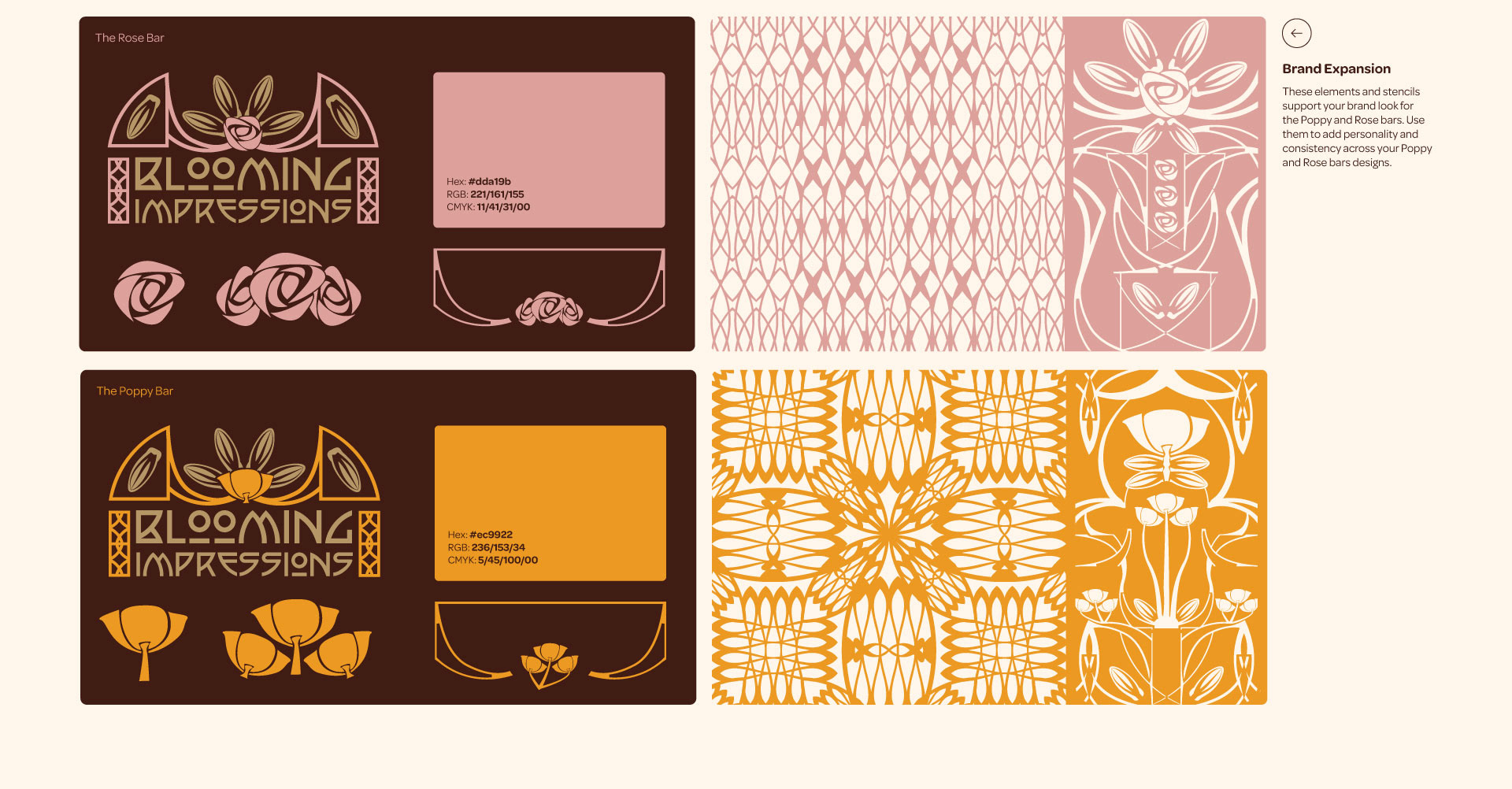
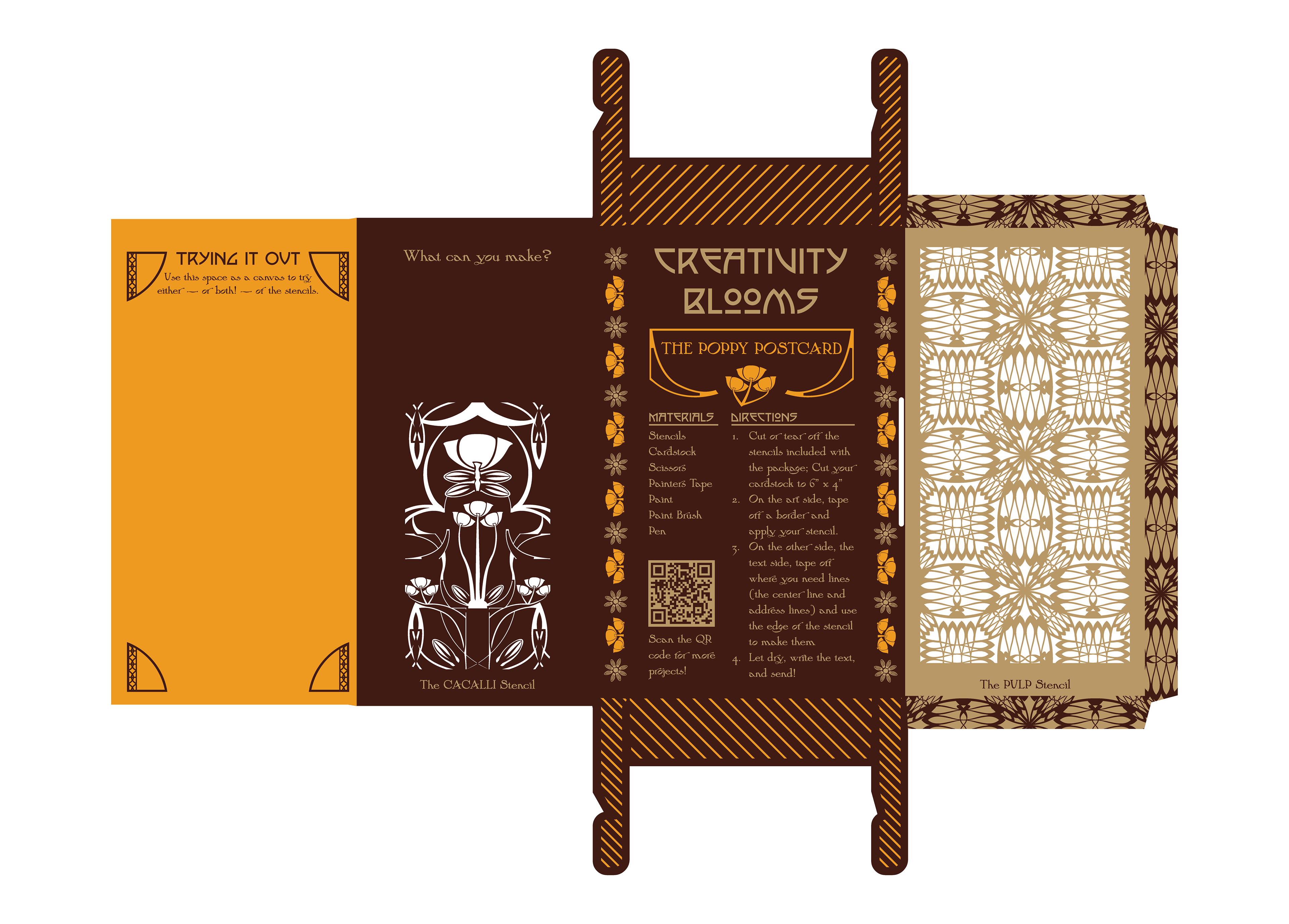
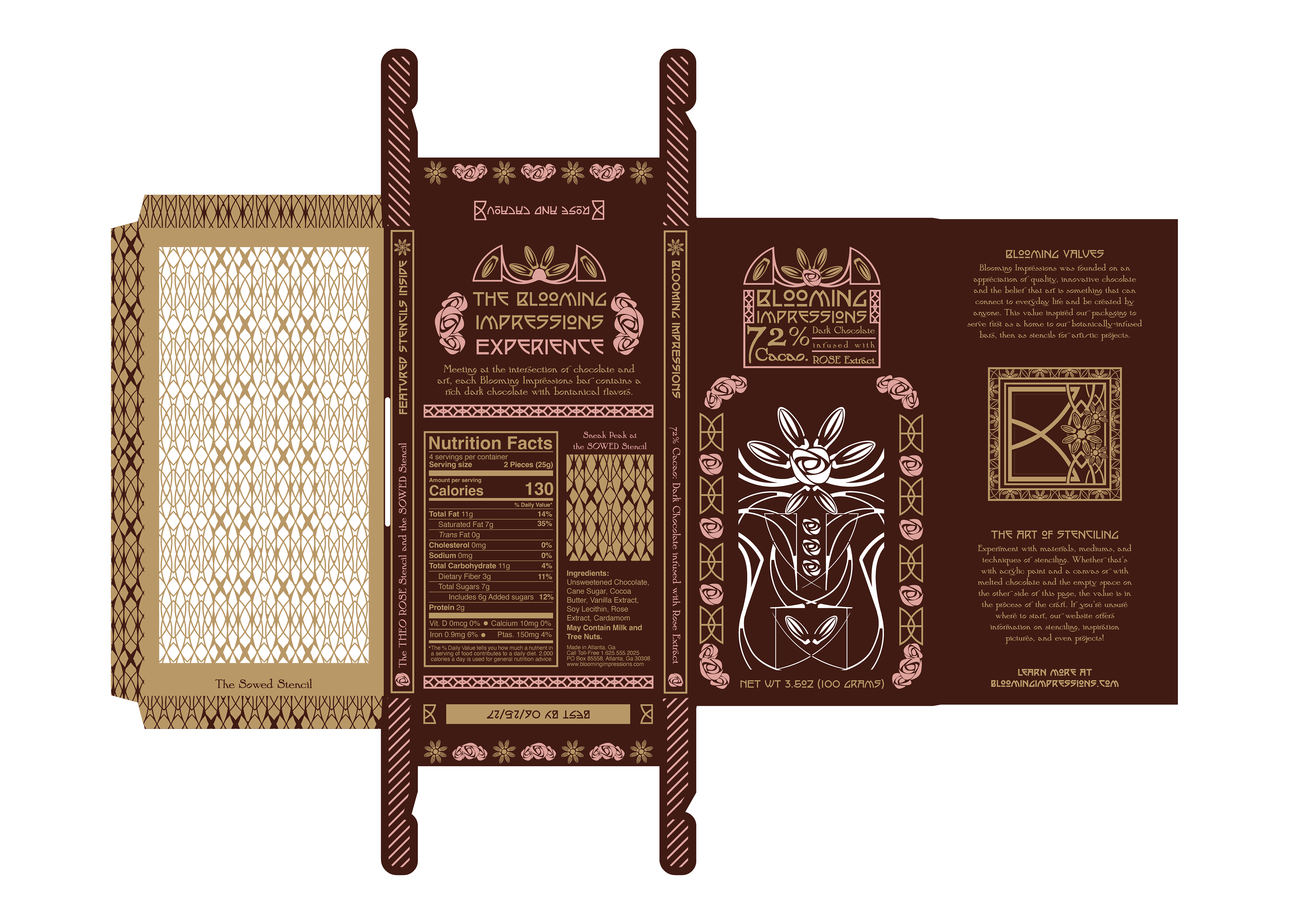
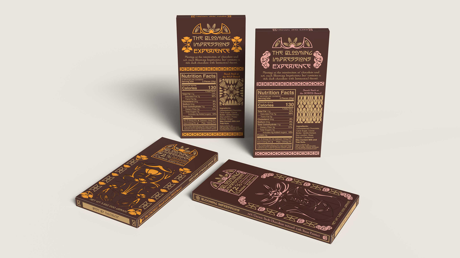
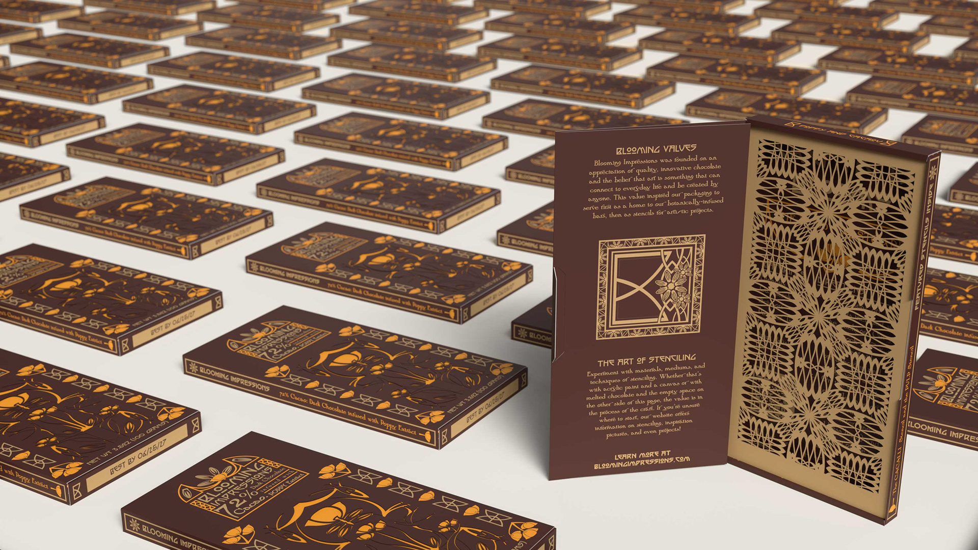
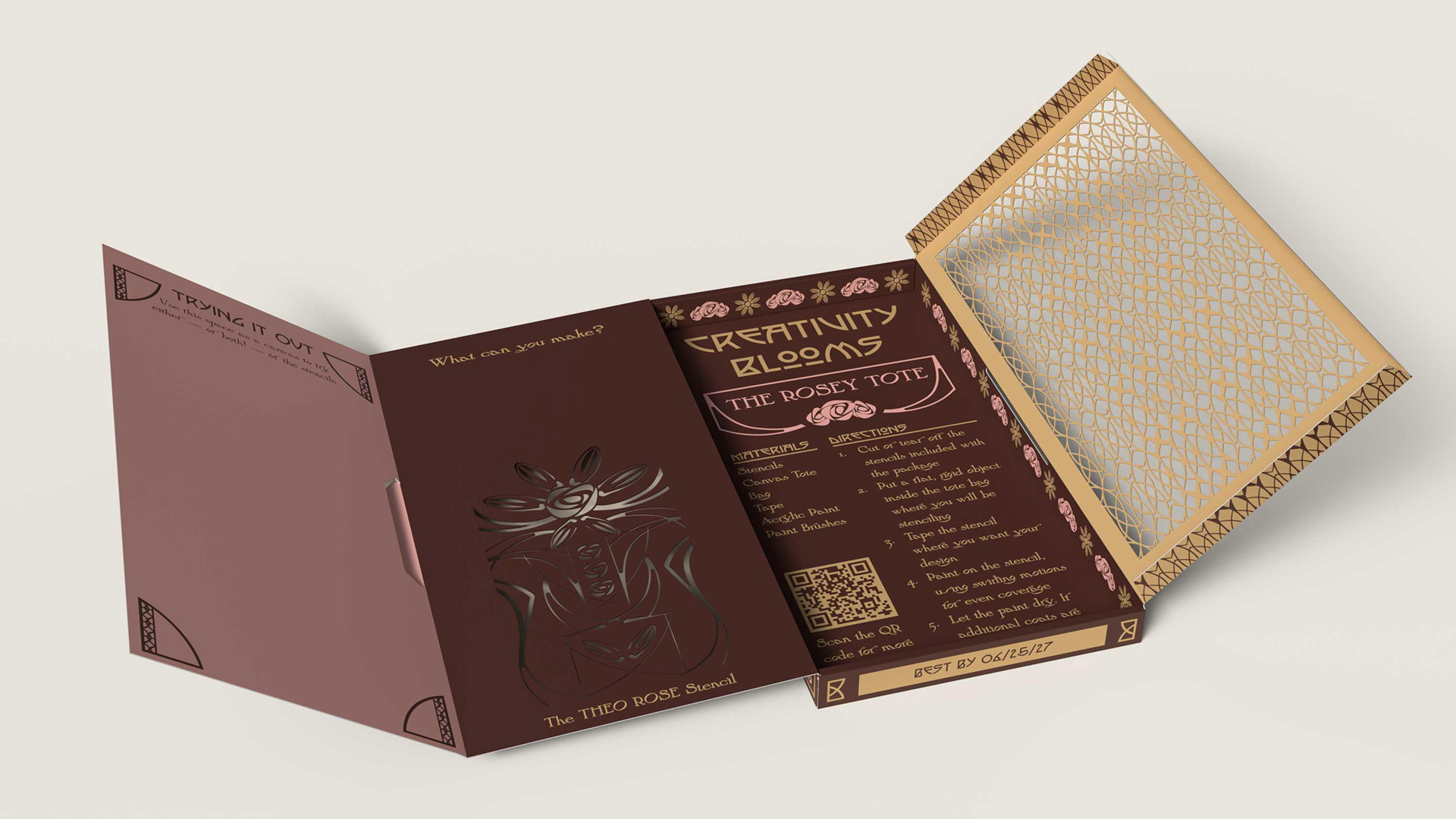
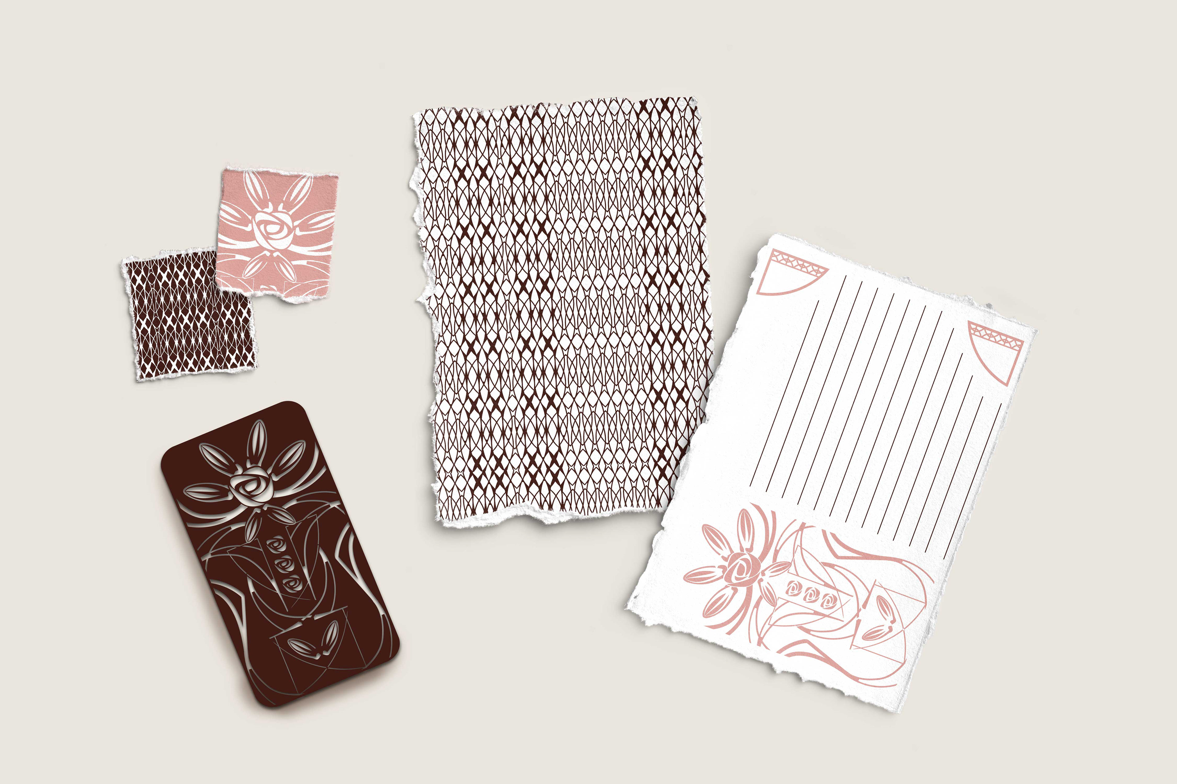
My concept bloomed from the values of the Arts and Crafts movement—emphasizing multifunctionality and the belief that anyone can be a crafter. Each Blooming Impressions bar is made with dark chocolate and features an additional flavor inspired by the motifs of the Arts and Crafts movement: rose or poppy, with ability to scale. The packaging of Blooming Impressions offers two unique stencils that can be cut out and used in a variety of ways by chocolate lovers, as well as resources and guidance in the craft.
Blooming Impressions emphasizes sustainability by creating packaging made to be used in multiple ways.
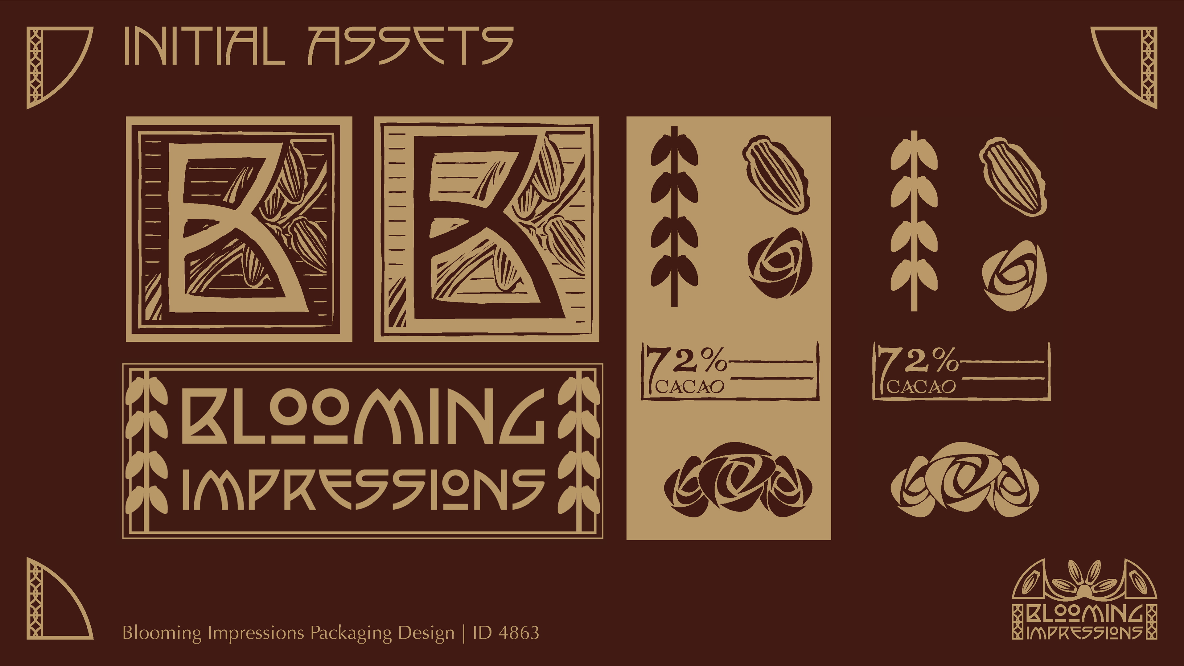
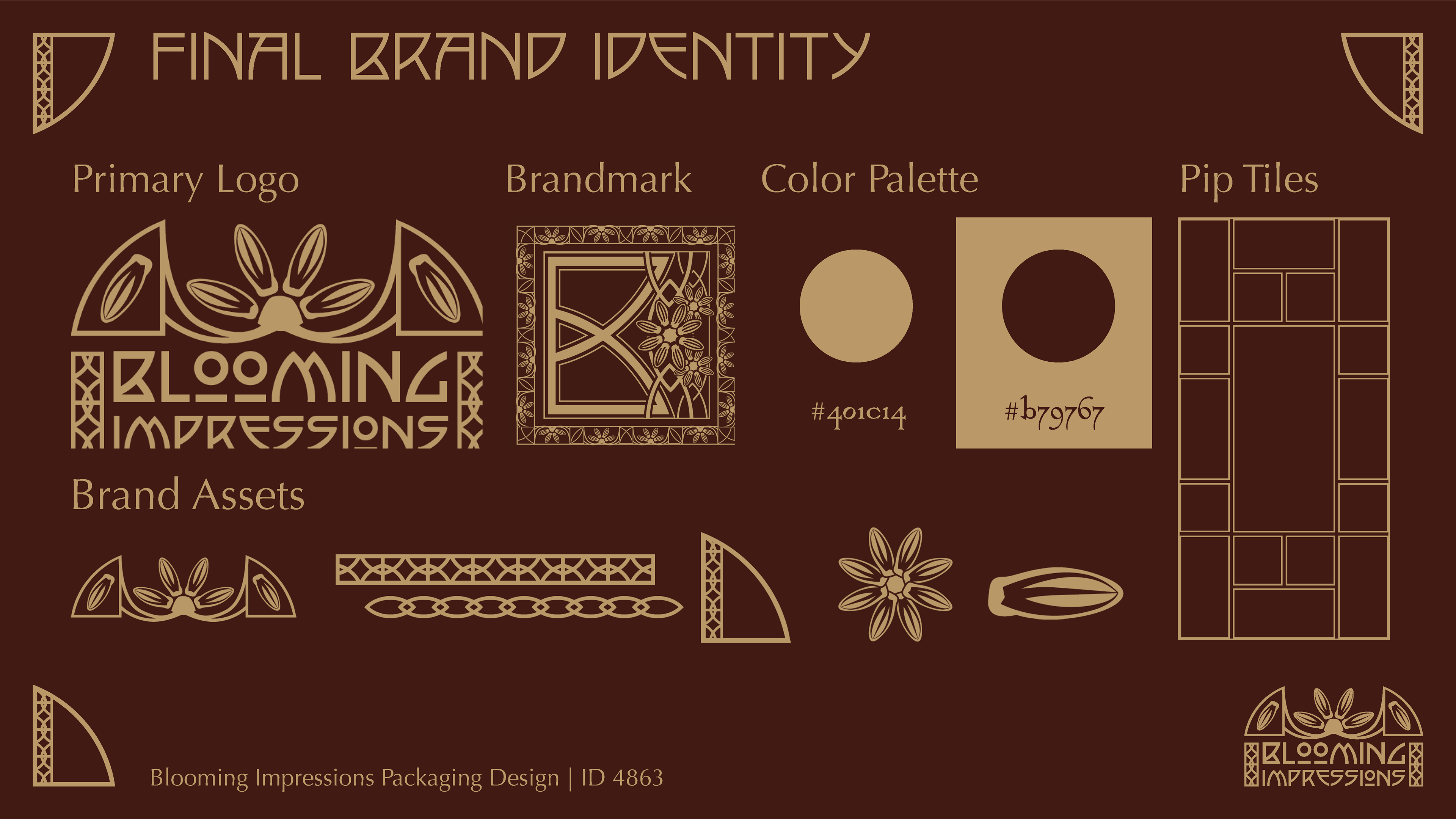
The Branding Process
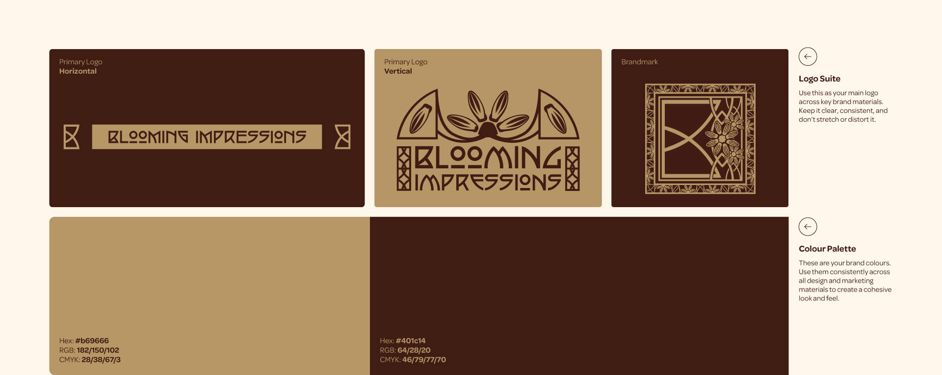
Inspired by the Arts and Crafts movement, certain aspects of the branding—such as the color palette and typography—were straightforward decisions based on the historical context of the movement. When it came to deciding which elements needed to be included for the bar packaging, and which needed variations based on the flavor, my challenge was unifying all of the assets to have a cohesive visual language.
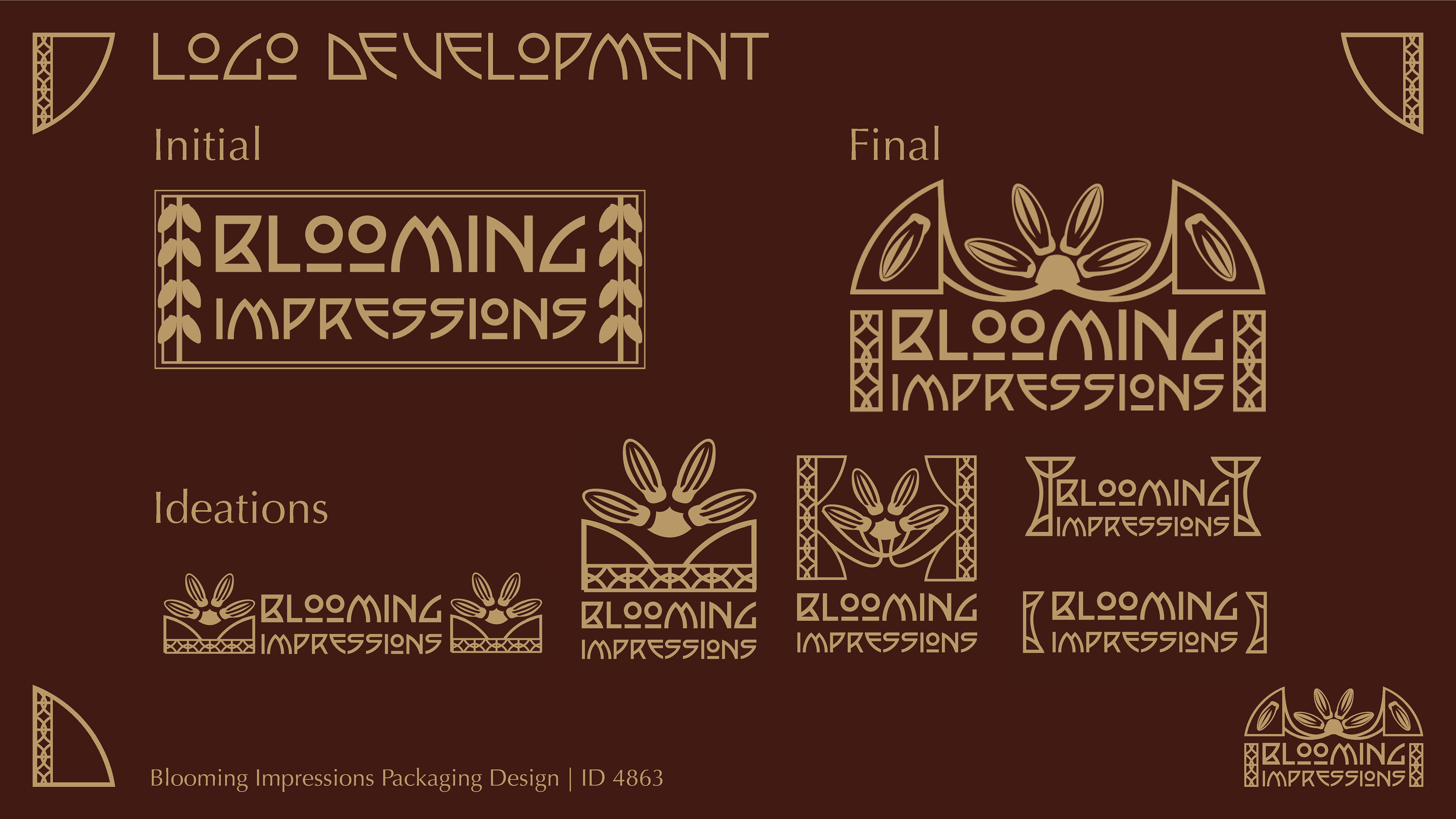
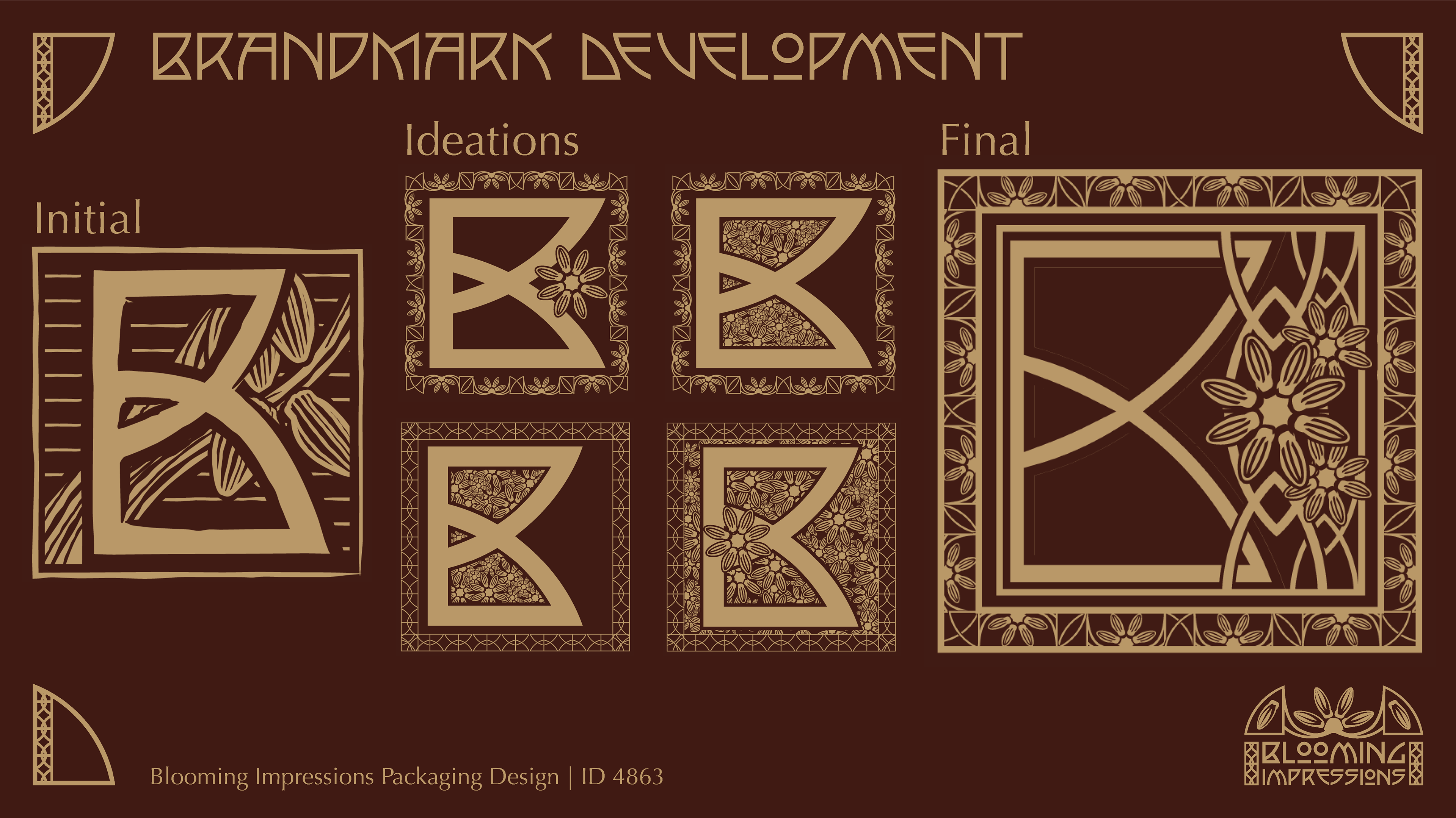
The first way I did this was by using parts of the base branding as small components in other elements. I used the different letters of the type as shapes to build parts of other elements such as the brandmark, the corner flourishes, parts of the stencils, and more.
The next way was by using elements as a “guide” when I created new ones or updated old ones to ensure the style was the same. When developing the Poppy Bar assets, I kept the Rose Bar assets nearby to make sure they dimensionally and aesthetically made sense together.
The Packaging Dieline and Real World Constraint
The dieline chosen for this concept had a lot of design panels available that created a unique unpackaging experience for the user.
FDA requirements for food packaging was met on all panels for the content and wording, typography, and accessibility. I used the Ghirardelli Intense Dark Chocolate Bar, 72% cacao, 3.5 oz bar as a reference for nutrition information.
The material is a .0197 in paperboard with laminated coating to make it both waterproof and durable as the stencils need to be reusable and long lasting.


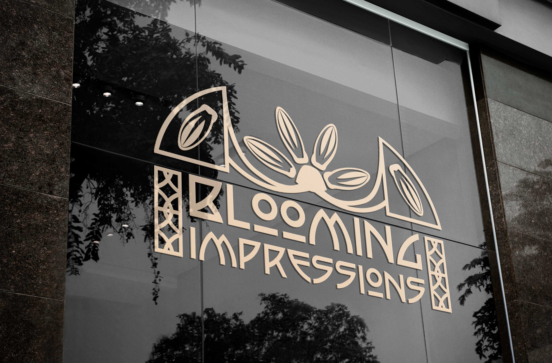
Extended Branding